Have you read Dewey Caron’s 2013-14 Survey reports yet?
If you have paid close attention to Dewey’s statistics you may notice that there are slight differences between his numbers and the numbers discussed on this MAPS page although we do access the same data set. It’s simple and harmless, our numbers WON’T align perfectly because Dewey grouped his statistics by club membership and because this portion of analysis is a “spatial study” it’s grouped by the hives physical location, regardless of club membership. Also some of Dewey’s reports mention commercial and side-liner beekeepers which is data that was gathered by him outside of this study specifically. Since there was not a fair population of the higher categories in this spatial study any apiary that had more than 14 hives have been removed from the 2014 Mapping results. Between this and some of the 2014 participants not including location, we were able to map 202 apiaries containing 576 hives throughout the Portland Metro Area from 154 beekeepers rather than the original 178.

2014 FLIGHT RADIUS MAP
The typical range of honey bees seeking forage nutrition is 1 to 3 miles. This 2014 FLIGHT RADIUS MAP (click image to enlarge) illustrates Portland’s bee flight range so you can see how well Portland Metro beekeepers are covering the pollination requirements of Portland trees, flowers, and community gardens with these 1 to 3 mile buffers around each apiary location. Higher densities of apiaries simply merge into a red mass but in reality we can’t actually map how far all of our bees travel for forage in this urban environment. Depending on the diversity of plants and their bloom seasons honey bees have been known to stay within a few hundred yards of their hives or travel as far as six miles to provide the nutrition required by colony.

2014 YEARS OF EXPERIENCE MAP
The 2014 YEARS OF EXPERIENCE MAP (click image to enlarge) uses the apiaries locations and assigns it the numerical value of the associated beekeepers years of experience. Then using kernel density the values are merged together based on years experience and distance from each other. Likewise the value fades to nothing the further it gets from its origin, which gives them this heat map type appearance. This is the format for the remainder of the 2014 maps.
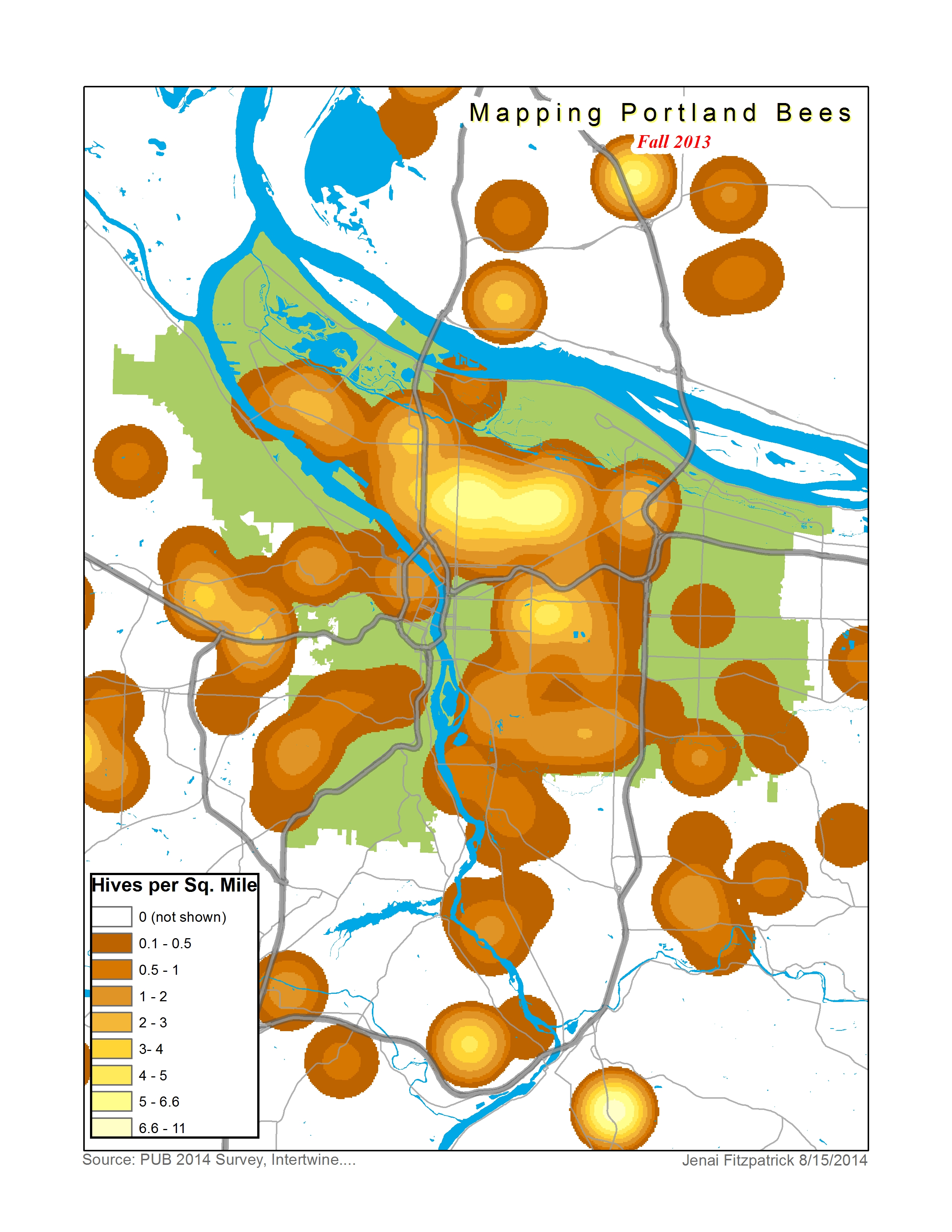
FALL 2013 HIVE MAPS
Looking at the FALL 2013 HIVE MAPS (click image to enlarge) legend you can see that the density map ranges from brown (signifying 0.1 to 0.5 hives per square mile) to a golden honey color (which signifies 3 to 4 hives per square mile) up to an almost clear yellow (signifying over 6 hives per square mile). Worth noting is that the 6.6 to 11 range is only present on this map in Oregon City where the 5 of the 6 apiaries entered were located by zip code, which the computer assigns to the center point of its zip code and proves useless for studies and maps at the urban scale. So the hot spots worth discuss in the Fall Hive map seem to be in centered around north Portland in the King, Sabin, and Beaumont Neighborhoods with a peak of 5-6 hives per mile. Further south the Sunnyside and Mt. Tabor Neighborhoods look to have good density just one step down the scale at 4-5 hives per square mile.
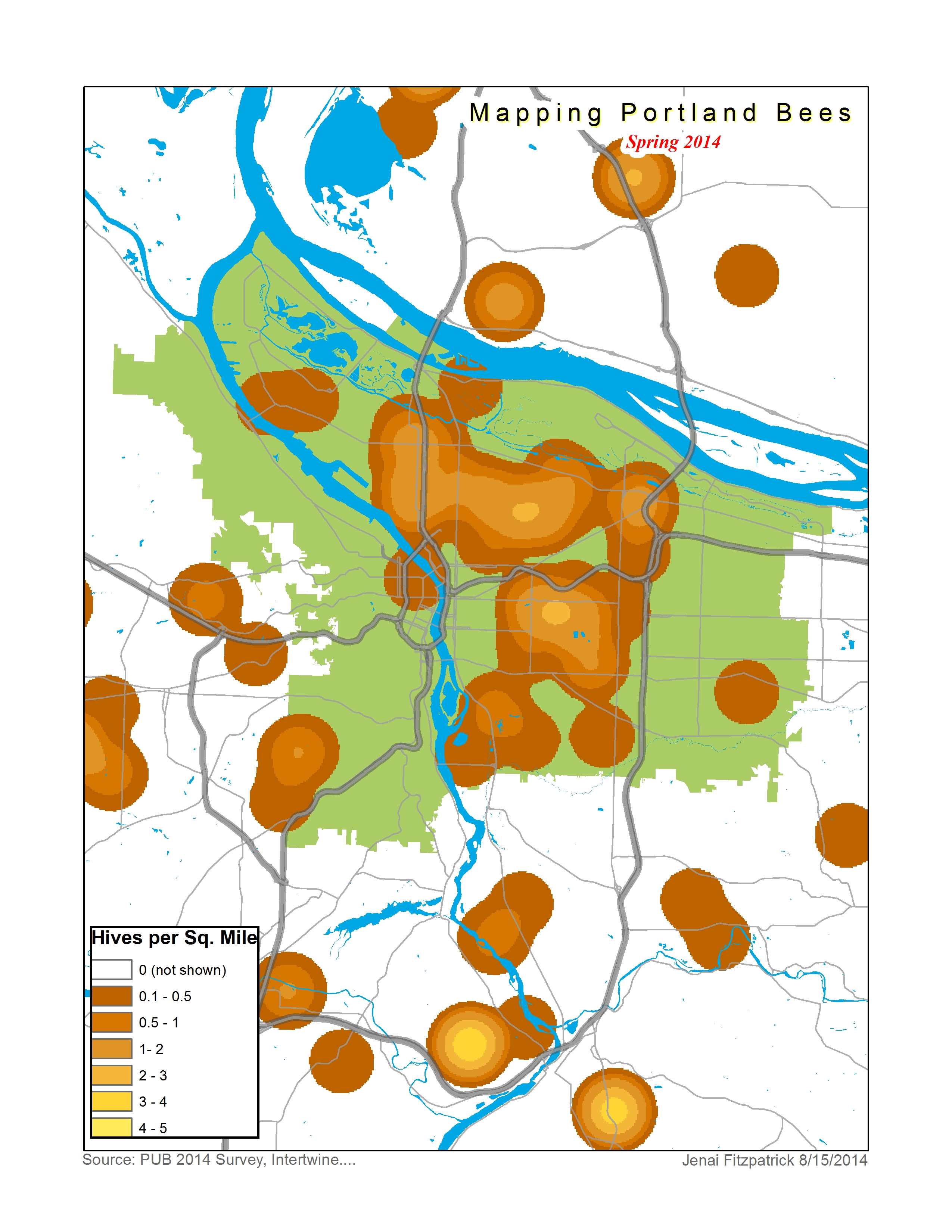
SPRING 2014 HIVE MAP
The following spring of 2014 these same survey participants indicated a reduction in apiaries leaving only 240 hives throughout the Portland Metro Area. Unfortunately when we assess the winter losses and look at the hives per square mile on the SPRING 2014 HIVE MAP (click image to enlarge) the story looks pretty bleak. With much more green showing in general where there was once at least a brown shade we are told that the loss has been complete in those areas. Our previous hive peaks in north Portland has been reduced to the Beaumont Neighborhood with a 50% loss itself peaking at 2 to 3hives per square mile. The same loss occurred in Mt Tabor.
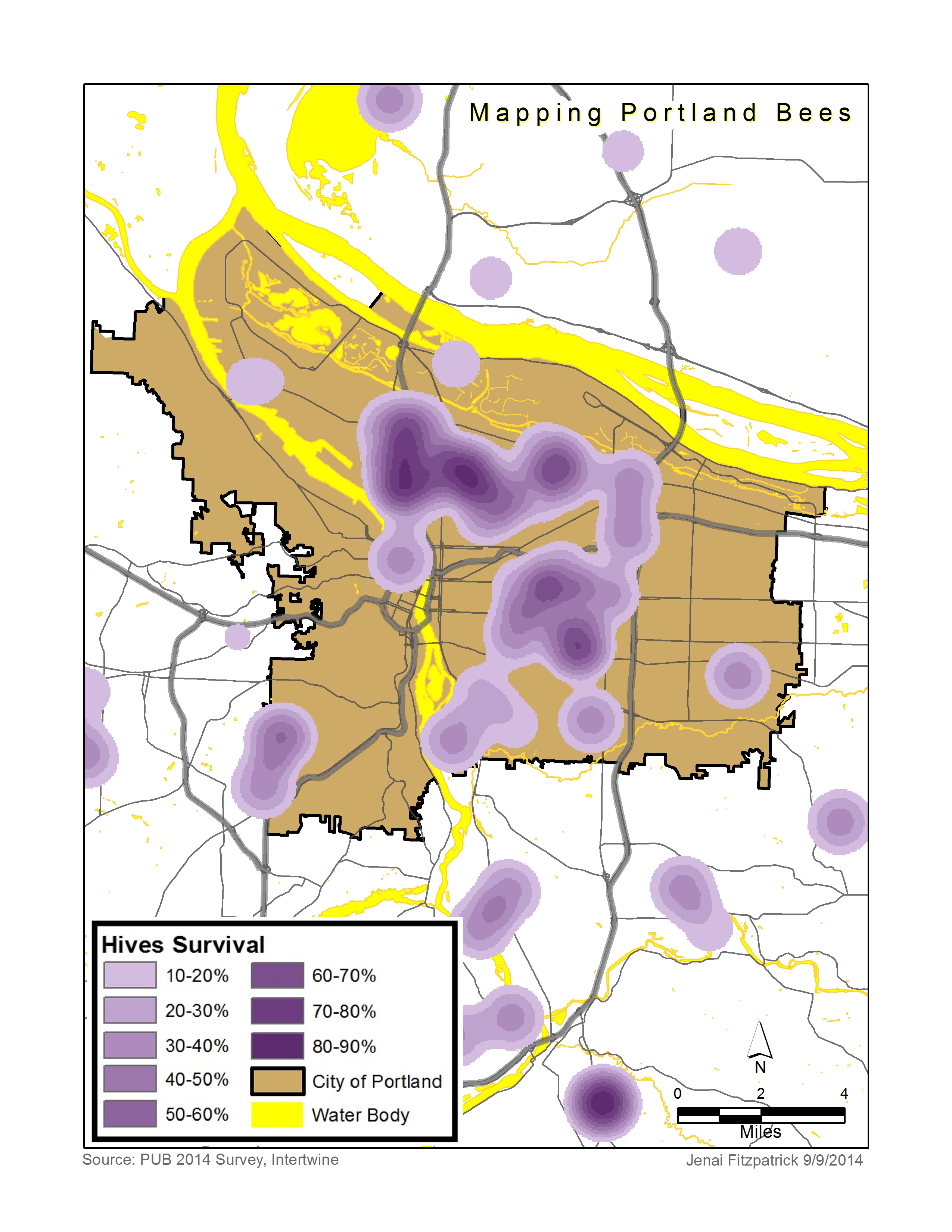
SURVIVAL 2014 HIVE
The SURVIVAL 2014 HIVE (click image to enlarge) shows a 58% loss overall in Portland metro area honey bees.